 Developer
Simple skinning guide
Introduction
This simple skinning guide provides different options to easily change the color appearance of the player. The skin used as a base is a simple color skin, adapted to support as many color variations as possible.
If you want to create a new skin or make advanced design changes, please have a look at our Advanced Skinning Guide or contact support@readspeaker.com to receive such documentation.
Demo
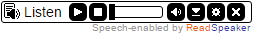
A demo is available in our Skin gallery
Skin Gallery
Implementation Instructions
Please note: in order for the service to work you need to include a reference to the ReadSpeaker.js-file
- Download the skin
Before you begin you should download the following skin file:- Download the skin
- Unpack the ZIP-file that contains your skin files; a JavaScript, a CSS and an image.
- All necessary files can now be found in the folder named ReadSpeakerColorSkin:
- ReadSpeakerColorSkin.css – The style definitions for this custom skin.
- ReadSpeakerColorSkin.js – The skin JavaScript file.
- ReadSpeakerColorSkin.png – The CSS sprite image we will be using.
- Add references to your skin files
Add links to your skin files from the page/template where you want use ReadSpeaker. These references should go in the HEAD section of the HTML page.Example<link rel="stylesheet" type="text/css" href="ReadSpeakerColorSkin/ReadSpeakerColorSkin.css" /> <script type="text/javascript" src="ReadSpeakerColorSkin/ReadSpeakerColorSkin.js"></script>
- Change the listen button code
The listen button’s code contains several CSS classes. If you want to use a custom skin, you need to replace the class rsbtn with whatever name your skin uses as its base class. The base class for this skin is: rsbtn_colorskin.
You must also remove the class rsimg from the element<span class="rsbtn_left rsimg rspart">
Example (shortened):
<div id="readspeaker_button1">
	<a accesskey="L" title="Title" href="...">
		<span class="rsbtn_left rsimg rspart">
		...
		</span>
	</a>
</div>
Should then be:
<div id="readspeaker_button1">
	<a accesskey="L" title="Title" href="...">
		<span class="rsbtn_left rspart">
		...
		</span>
	</a>
</div>
Adapting the skin
Edit the CSS file
Let’s go through the vital parts in the CSS-file. Explanations and comments follow after each code block.
General color settings
The container
.rsbtn_colorskin {
	...
	border: 1px solid #000;
	background: #fff;
	-moz-border-radius: 3px;
	border-radius: 3px;
}
We start off by defining the layout of the div container that hosts the listen button as well as the player. The border needs to be defined here to ensure it surrounds both the player and the listen button.
The background color is set to white (#fff) and we are also using CSS3 to set rounded borders on the player which will be used when supported by the web browser.
Button preferences
.rsbtn_colorskin .rspart.rsbutton {
	background-color: #000;
	width: 18px;
	height: 18px;
	...
	-moz-transition: background-color .2s ease;
	-webkit-transition: background-color .2s ease;
	-o-transition: background-color .2s ease;
	transition: background-color .2s ease;
}
This class defines all buttons in our skin. We want to make sure that they use the same dimensions and background color. The transitions are there to make the rollover effect a little smoother.
.rsbtn_colorskin .rspart.rsbutton:hover {
	background-color: #ccc;
}
We add a very subtle color effect when the mouse pointer hovers the buttons. Thanks to the transition directives in the .rsbutton definition, this effect is appears animated.
Listen icon
.rsbtn_colorskin .rsbtn_left .rsbtn_text {
	background: transparent    url(http://f1-eu.readspeaker.com/graphic/default/buttons/icon_16px_black.gif) no-repeat scroll 0 0;
	padding-left: 20px;
}
This defines the listen button and the listen icon. Since this is part of the implementation code that sits in the actual webpage we choose to not add the .rsimg class, but instead we redefine the background image. You can choose from a variety of listen buttons that you find here:
Background image
.rsbtn_colorskin .rsimg {
	background: transparent url(ReadSpeakerColorSkin.png) no-repeat scroll 0 0;
}
We are going to use a CSS sprite for all bitmap graphics. With the definition above we make sure that all elements that have the rsimg class will use the sprite as a background image.
The sprite image looks like this (background color has been added for visibility):
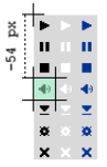
Using the background-position directive we can select certain slices of the image by changing the offset. The top-left corner has the position 0, 0 (X, Y). The above image shows how the black volume icon is selected by setting the vertical offset to -54 pixels.
The position is defined as: background-position: 0 -54px
Color and positioning
We will set the background position for each element. You can see the class names in this
image (at 200% zoom):
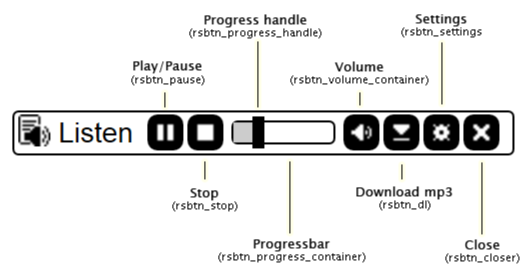
Play/Pause button
.rsbtn_colorskin .rsbtn_pause {
	background-position: -18px -18px;
}
.rsbtn_colorskin.rspaused .rsbtn_pause,
.rsbtn_colorskin.rsstopped .rsbtn_pause {
	background-position: -18px 0px;
}
This is the definition of the Play/Pause button (.rsbtn_pause). The first rule makes sure that the background image is correct. Then, we change the background image to display a play symbol when the player is in the paused (.rspaused) or stopped (.rsstopped) state, which we can see in the second rule. When the player is expanded, the play/pause toggle event will automatically be assigned to .rsbtn_pause.
Stop button
.rsbtn_colorskin .rsbtn_stop {
	background-position: -18px -36px;
}
This is the stop button (.rsbtn_stop). We make sure that the background image is correctly positioned. ReadSpeaker will assign the stop event to this element.
Progress slider
.rsbtn_colorskin .rsbtn_progress_container {
	border: 1px solid #000;
	width: 50px;
	height: 10px;
	margin-top: 3px;
	...
}
This is the CSS for the progress bar container. You can set the border color as well as changing the dimension of the container.
.rsbtn_colorskin .rsbtn_progress_handle.rsimg {
	...
	background-color: #000;
	top: -3px;
	left: -3px;
	width: 6px;
	height: 16px;
	...
}
This is the drag handle that the user can drag to jump in the audio file. You can set the color of the handle, change the dimension or change the positioning.
.rsbtn_colorskin .rsbtn_progress_played {
	...
	background-color: #ccc;
	...
}
This is the color that fills the progress bar as it plays.
Note! Both the drag handle and the progress bar need to be positioned absolutely in order for them to work.
Volume button
.rsbtn_colorskin .rsbtn_volume {
	margin-left: 4px;
	background-position: -18px -54px;
}
We set the volume button’s background position and add a little margin to make it symmetrical to the other buttons. Clicking this element will toggle the visibility of the volume slider container.
Volume slider
.rsbtn_colorskin .rsbtn_volume_container {
	...
	width: 16px;
	height: 40px;
	border: 1px solid #000;
	background: #fff;
}
This is the CSS for the volume container. You can set the border color as well as changing the dimension of the container.
.rsbtn_colorskin .rsbtn_volume_slider {
	width: 6px;
	height: 30px;
	margin: 5px;
	background: #ccc;
}
This is the volume bar. You can change the fill color of the volume bar as well as the positioning or dimensions.
.rsbtn_colorskin .rsbtn_volume_handle.rsimg {
	...
	top: -3px;
	left: -3px;
	width: 12px;
	height: 6px;
	background: #000;
}
This is the drag handle that the user can drag to change the volume. You can set the color of the handle, change the dimension or change the positioning.
Note! Just like for the progress slider the drag handle must be positioned absolutely in order to work.
Download Button
.rsbtn_colorskin .rsbtn_dl {
	background-position: -18px -72px;
}
This is the download button. Make sure that the background position is correct.
Settings Button
.rsbtn_colorskin .rsbtn_settings {
	background-position: -18px -90px;
}
This button opens the settings dialog. All we do in the CSS is to change the background position so that the right icon is displayed.
Close Button
.rsbtn_colorskin .rsbtn_closer {
	margin-left: 4px;
	background-position: 0 -106px;
}
We add a little extra left margin and set the background position. The close player event will be automatically assigned to this element.
Popup button
.rsbtn_colorskin.rspopup {
	position: absolute;
	background: #fff;
	border: 1px solid #555;
	box-shadow: 0 0 5px #777;
	display: none;
}
Finally, we add a rule that controls the popup button/popup player. The position statement is important in order to not disturb the document flow when the popup button is displayed. The box shadow is there to make the popup stand out from the rest of the page and make it more visible.